Thursday, April 30, 2015

Final - Cartographic Skills - GIS 3015


Our final project for Cartography class required that we provide a high quality map to be published in an national newspaper. Its not actually going to be published but the quality for potential publication has to be there.

The map needs to display information about the 2013 standardized test scores for graduation seniors across America.I choose the ACT exam because the data range for test score was only 7 points. This allowed me to do a manual classification and provide a very accurate representation of state scores. Other classification methods would not allow me such accuracy. 

I played around with 3D representation, using a choropleth map then placing pie charts on top of that, but it all seemed to try and compete for the map readers attention when trying to interpret the data.
Then I thought about dot mapping and using dot density to show the percentages of students tested.  I realized after watching lots of youtube videos that lines would be better. 


Using data from the US Census bureau I created a basemap for the final project however something went aery in he end because the scale is so not right, by the time I noticed that it was time to turn in the assignment.

Looking back the line spacing could have been more dramatic to help readers with the percentage of tested students. However I do think that changing the direction of the lines helps to lower potential confusion.


Sunday, April 12, 2015

Week 13 - Geographic Info Systems

Learning georeferencing is kind o neat. Watching the computer program line up the polygons with the picture is neat. I can stand on the top of a tall building in my town and use georeferencing to put it on global map. 

On my first image I thought this georeferencing thing was easy. The first image I attempted to reference it only took me 3 points and I had a zero root mean square error. The second wasn’t quite as simple, but that’s why it pays to read all of the instructions more than once.  After vigorously adding 17 points in attempt to get my map aligned correctly I noticed a little note about 2nd order polygon. All of a sudden it was like magic.


 Then we used the data from this map I then used ArcScene to take the polygons and line features from the map above and create a 3D map.
 Raise the height of the images above a the DEM image, exaggerate the features and you get a 3D image.


Week 12 - Cartographic Skills - GIS 3015


Google Earth is a very neat tool for cartographers and the everyday person. You can visit a place without visiting a place, you can help people who are thousands of miles away. You can collect information and use it to curator your own map library. This technology is making the world smaller.

I used a dot map from my previous assignment in class. By converting my map of South Florida into a KML file I was able to layer it on top of Google Earth and view it on the globe. Placing statistical information on a globe can provide individual with additional understanding for that specific area. It also allows Google to provide the additional information you might not have like the names of all of the cities located in the area.


With the map that I made I also created a tour of South Florida
Map like this one could be used by tourists visiting from France. Its a lot less likely they will get lost if they know what the buildings look like and the street names.

South Florida Google Earth Tour


You can also view tours made by other people.


Tuesday, April 7, 2015

Week 11 - Cartographic GIS 3015


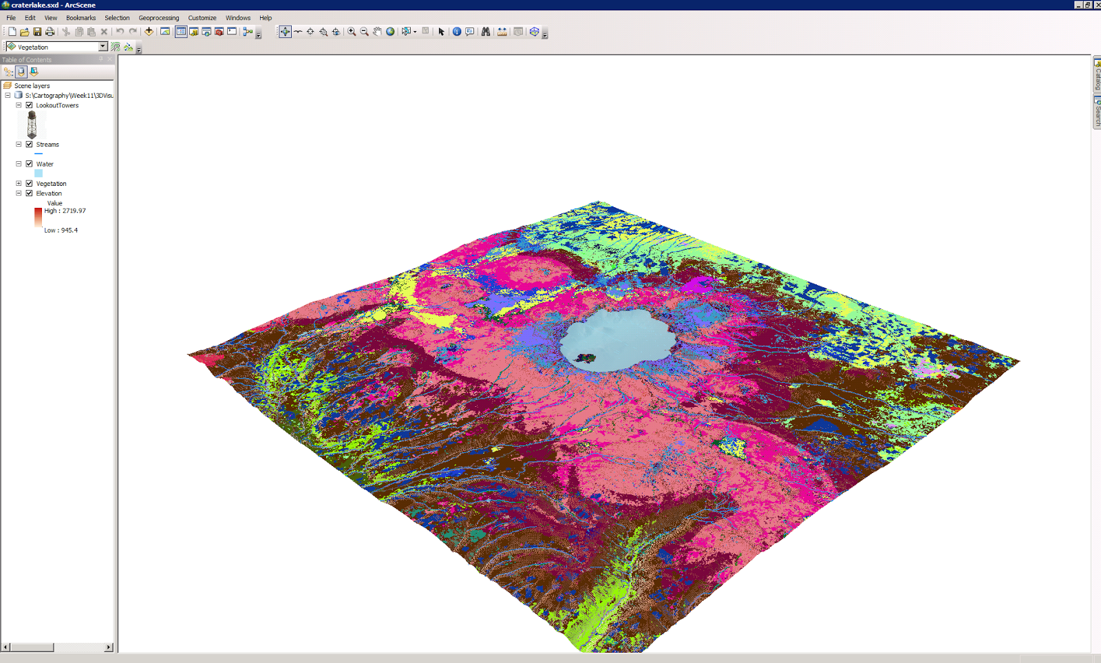
Map 1 Base Heights
This map uses elevation to show you the land and vegetation around a lake. The 3D map includes vegetation which can make individuals aware of poisonous plants in the area or plants that attract predators that you may want to stay away from.  Having visual lands references would probably make it easier for someone to identify these things once they get out into nature.


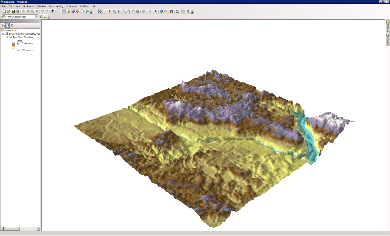
Map 2 Vertical Exaggeration
Base height and vertical exaggeration have similar uses. The details provide and the fact that you can zoom in at very close levels to discuss details are important especially when applied to safety. If this area was a public park it would be helpful in showing hikers areas that are too steep to travel.


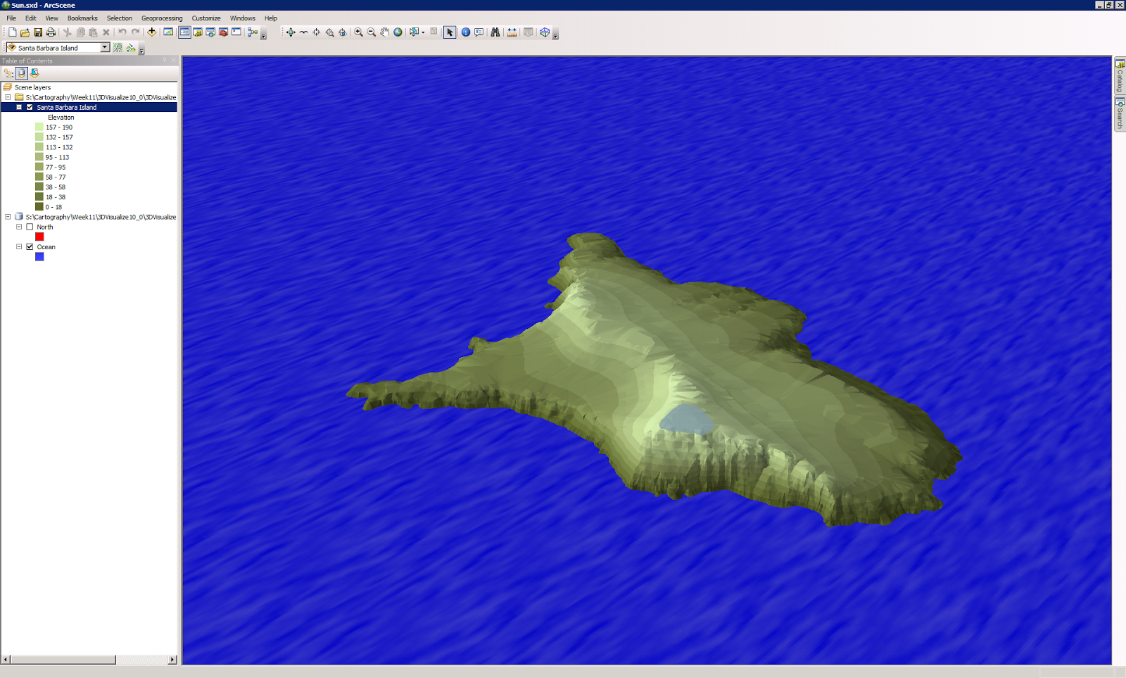
Map 3 Illumination and Background color
The interesting part of this map for me is that the 3D elements of height variation are not as important as the colors effects. The tone of the colors and variations of the color patterns are what makes the image actually look like an island. The software being able to apply the a virtual representation of how the sun effects a real image is what makes this appear to be real. The principles of light are just as important as visual rendering in many presentations.


Map 4 Extrude buildings and wells
This image provides a 3D rendering on a real world image.  Allowing for land use and placement on a 3D map versus a miniature model being built and placed in the center office for investors to come by and inspect. Placement of the wells and there depth can be beneficial to city planners and utility providers.


Map 5 Extrude parcel values
Real Estate being a non renewable resource this application is very beneficial to developers, city planning/permits and the local tax authority. Matching monetary values with a geolocation provides the bottom line for most end users, revenue potential.