Sunday, May 3, 2015

Final Intro to GIS


Bobwhite-Manatee Transmission Line

Determine an optimal location in relation to school, hospitals and environmentally sensitive lands in Manatee and Sarasota county.


In addition to cost considerations there are three goals that the survey attempted to mitigate:  

  • Reduce the transmission line's proximity to schools and hospitals.
  • Reduce the transmission line's proximity to environmentally sensitive land areas.
  • Determine a route that will least affect private property and home ownership. 


Powerpoint Commentary

Presentation

Thursday, April 30, 2015

Final - Cartographic Skills - GIS 3015


Our final project for Cartography class required that we provide a high quality map to be published in an national newspaper. Its not actually going to be published but the quality for potential publication has to be there.

The map needs to display information about the 2013 standardized test scores for graduation seniors across America.I choose the ACT exam because the data range for test score was only 7 points. This allowed me to do a manual classification and provide a very accurate representation of state scores. Other classification methods would not allow me such accuracy. 

I played around with 3D representation, using a choropleth map then placing pie charts on top of that, but it all seemed to try and compete for the map readers attention when trying to interpret the data.
Then I thought about dot mapping and using dot density to show the percentages of students tested.  I realized after watching lots of youtube videos that lines would be better. 


Using data from the US Census bureau I created a basemap for the final project however something went aery in he end because the scale is so not right, by the time I noticed that it was time to turn in the assignment.

Looking back the line spacing could have been more dramatic to help readers with the percentage of tested students. However I do think that changing the direction of the lines helps to lower potential confusion.


Sunday, April 12, 2015

Week 13 - Geographic Info Systems

Learning georeferencing is kind o neat. Watching the computer program line up the polygons with the picture is neat. I can stand on the top of a tall building in my town and use georeferencing to put it on global map. 

On my first image I thought this georeferencing thing was easy. The first image I attempted to reference it only took me 3 points and I had a zero root mean square error. The second wasn’t quite as simple, but that’s why it pays to read all of the instructions more than once.  After vigorously adding 17 points in attempt to get my map aligned correctly I noticed a little note about 2nd order polygon. All of a sudden it was like magic.


 Then we used the data from this map I then used ArcScene to take the polygons and line features from the map above and create a 3D map.
 Raise the height of the images above a the DEM image, exaggerate the features and you get a 3D image.


Week 12 - Cartographic Skills - GIS 3015


Google Earth is a very neat tool for cartographers and the everyday person. You can visit a place without visiting a place, you can help people who are thousands of miles away. You can collect information and use it to curator your own map library. This technology is making the world smaller.

I used a dot map from my previous assignment in class. By converting my map of South Florida into a KML file I was able to layer it on top of Google Earth and view it on the globe. Placing statistical information on a globe can provide individual with additional understanding for that specific area. It also allows Google to provide the additional information you might not have like the names of all of the cities located in the area.


With the map that I made I also created a tour of South Florida
Map like this one could be used by tourists visiting from France. Its a lot less likely they will get lost if they know what the buildings look like and the street names.

South Florida Google Earth Tour


You can also view tours made by other people.


Tuesday, April 7, 2015

Week 11 - Cartographic GIS 3015


Map 1 Base Heights
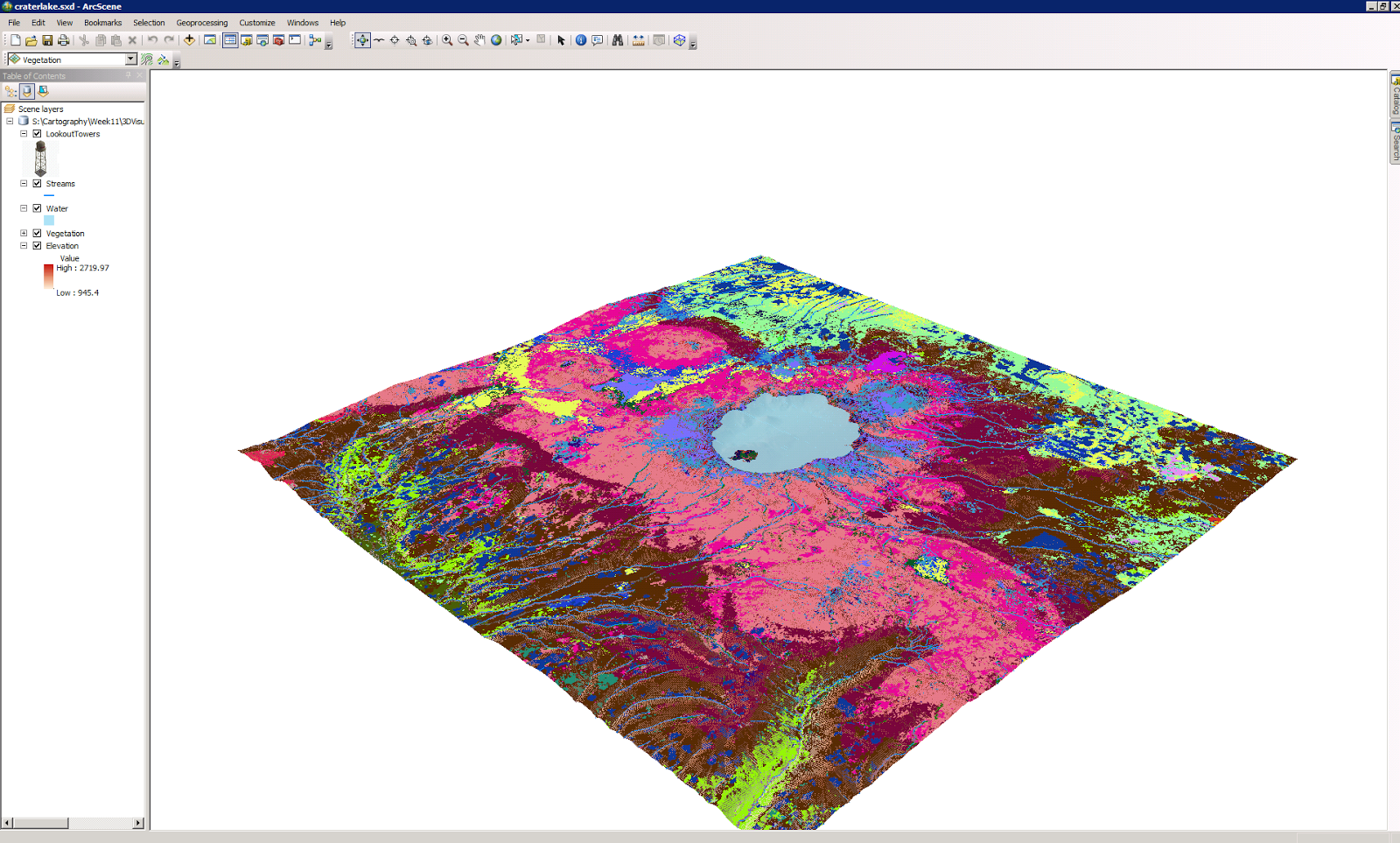
This map uses elevation to show you the land and vegetation around a lake. The 3D map includes vegetation which can make individuals aware of poisonous plants in the area or plants that attract predators that you may want to stay away from.  Having visual lands references would probably make it easier for someone to identify these things once they get out into nature.


Map 2 Vertical Exaggeration
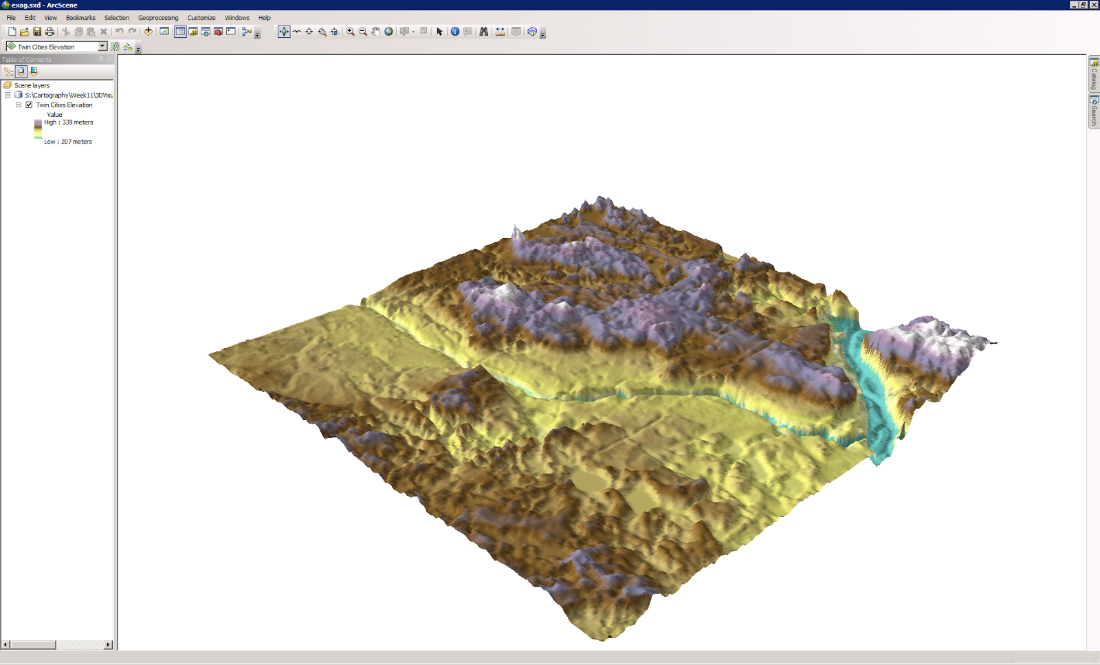
Base height and vertical exaggeration have similar uses. The details provide and the fact that you can zoom in at very close levels to discuss details are important especially when applied to safety. If this area was a public park it would be helpful in showing hikers areas that are too steep to travel.


Map 3 Illumination and Background color
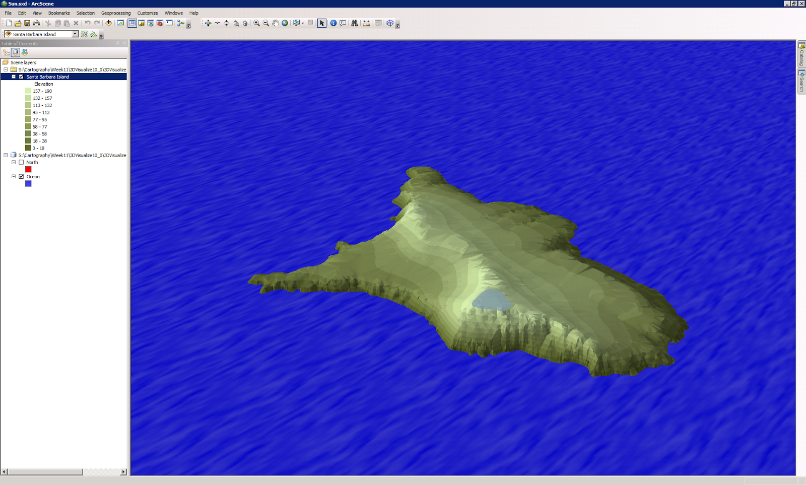
The interesting part of this map for me is that the 3D elements of height variation are not as important as the colors effects. The tone of the colors and variations of the color patterns are what makes the image actually look like an island. The software being able to apply the a virtual representation of how the sun effects a real image is what makes this appear to be real. The principles of light are just as important as visual rendering in many presentations.


Map 4 Extrude buildings and wells
This image provides a 3D rendering on a real world image.  Allowing for land use and placement on a 3D map versus a miniature model being built and placed in the center office for investors to come by and inspect. Placement of the wells and there depth can be beneficial to city planners and utility providers.


Map 5 Extrude parcel values
Real Estate being a non renewable resource this application is very beneficial to developers, city planning/permits and the local tax authority. Matching monetary values with a geolocation provides the bottom line for most end users, revenue potential.


Friday, March 27, 2015

Week 11 - Geographic Info Systems - GIS4043


This weeks map required the use of ArcPython.


Understanding the basics of running scripts with map making actually starts to show that cartographers create 20 maps and the analyst and compare the data much faster than maybe even tn years ago.
This map show the best place for a camp site in De Soto National Forest based on its proximity to a road, water an not being within a conservation area. Now running each of those scripts or options manually could be very time consuming. This is great especially if you just received an new map data because this year has produced a very heavy rain season and the camp grounds open up tomorrow.
You would want to have the map in hand and the ability to drive the area or verify it with aerial surveillance. 


Thursday, March 26, 2015

Week 10 - Cartographic GIS 3015

This week we work on Dot mapping.

Dot Mapping is taking raw data usually a compilation of numbers and using it represent different variables (ie population, religious belief, race). These variables are represented by a dot using a maximum number and a geolocation.  They are placed throughout a region and can make for detailed yet simplistic interpretation by the average individual. 
This dot map had me in a crunch this week. I am not sure why it was so mean but it pretty much kick my tail. Attempting to represent an accurate picture can be challenging. If drawn incorrectly you could skew information and cause the map reader to falsely interpret you message. The information provided to use by the census bureau is divided by county. If the dots where map in any random place through out counties in Florida it might make Lake Okeechobee look like a very lively neighborhood. Since most of south west Florida is marsh or swamp, having the dots only fall on urban areas becomes really important. Unless you want the rest of the world to think the History Channel's Swamp People is the only thing to the left of Miami.


Saturday, March 21, 2015

Week 9 - Cartographic GIS 3015

This week focused on Flow maps.

The use of flow maps has an esthetic appeal for many. The line width makes the information easily interpretable. People automatically associate size with a value, bigger equals more and small equates to less.

I decided since we where mapping immigrants into the United States I decided to attempt political correctness with this maps design theme. The over arching color theme of the map is red white and blue.
Associating immigrants with a symbols that many Americans associate with freedom may cause  subconscious visual appeal.  Better to associate immigration with freedom than with all of the other negative stereotype that society throws at it.
With the techincal elements of the map I made all of the flow lines transparent up to 25% and placed them under any land features so they would not detract from smaller objects like islands.  As an inset map I placed the smaller map to show the disbursement of immigrants through out the country. On the bigger map I decided to keep the map simple. I did not want to much clutter and with an attempt to just focus on America itself.


Saturday, March 14, 2015

Week 6 - Cartographic Skills - GIS3015

Data Classification is the subject of the week.
It was very interesting to see just how different the same information can be presented just by changing the way it is distributed. It reminds me of lying with maps. If I was a realtor I could use the same information to make a retiree feel welcome and among individuals of the same age, that I could to make them feel that it only and handful of retirees are in the area.

Proper representation is very important especially when it comes to getting public services for the area. You want the map truest to reality. I feel that would be the natural breaks or equal interval map. Don't you agree?


Tuesday, March 10, 2015

Week 8 - Cartographic GIS 3015

I really enjoyed making the maps for this assignment. I never really paid attention to the way thermal maps looked until I created my own.
 The hypsometric map appears to provide a greater amount of information than the continuous tone map because it has a more detailed legend but in reality it all depends on what the client wants.

The contours feel like an additional information that just makes the map more difficult to read.  However if you were trying to pick an area for a farm of a climate sensitive building you may also want to know the elevation.  Placing the contours on a separate map would be unnecessary when you can just give the client what they asked for in one go round.


This data was obtained from:?
U.S. Department of Agriculture, Natural Resources Conservation Service, National Geospatial Management Center
The official publisher of the data and the publication date: U.S. Department of Agriculture, Natural Resources Conservation Service, National Geospatial Management Center 09/2012

Original creator of dataset: The PRISM Group at Oregon State University
Dataset title: 20060101

PART II: Lab Questions 
Answer all questions and explain your answers!

1. What does continuous tone symbology mean?
a. Using continuous tone symbology means a map is made with colors gradually changing / stretching between color spectrum to represent different data. There is no exact beginning or end of one color.  It is just a gradual subtle  change. It is kind of like when you give a little child a box of crayons to draw with. When you come back and you can see all of the colors have been used however you aren’t really sure where they start and end. 
2. How did you implement continuous tone symbology on your map?
a. This assignment was very straight forward. There wasn’t much for me to do beyond follow instructions. I used the precipitation color ramp with the hill shades effect.  
3. What does hypsometric tinting mean?
a. Using hypsometric tinting means that the color change will still follow the color spectrum however it will be more abrupt. You will be able to differentiate between the values a lot easier.  
4. How did you implement hypsometric tinting on your map?
a. Again this was a very straight forward assignment. I just followed the instructions. I did implement contours with this map. 
5. Which map do you think best presents the data and why?
a. After completing this assignment I can see the value behind each data representation. I do believe if using the continuous tone map you need to have contours or some else implemented to help the average map reader to understand. 
b. If this map is just for the everyday person i would suggest using hypsometric tinting. The information is much easier to process. 

Week 7 & 8 - Geographic Info Systems - GIS4043

So this week we had to find our own data sources and provide maps and information based on our research.

This would have been a piece of cake if people would just provided everything you need using the same data system. (lol if only) Or even better if the data didn't find some way to continuously break itself. I spent most of my time with IT on this project because it hated me.
Martin County, Florida is a very small town that is sparsely populated, when compared with the rest of the state. Its main cities are parts of metro ares that are located in other counties.
For this project I had to create my own data for the cities using Google maps to get the coordinates of each city. That was a fun search.
Hopefully you like my maps!


Monday, February 16, 2015

Week 7 - Cartographic Skills - GIS3015

This map shows to population density of males vs females as well as the wine consumption of each country in the region. 
 I think using population density as a bases for the data is a good way to classify the information.
Using population density, specifically for wine consumption would help explain high concentration areas of drinking. If only two people live in each 100 mile radius of one country and the next country has 3,000 individuals per 100 miles the wine consumption would easily be explained. If you listed only how many individuals consumed wine it might give and unfair judgment of the country with the higher population.


Thursday, February 12, 2015

Week 5 - Geographic Info Systems - GIS4043

Projections

Using a different project provided different scales for each county. the projections vary from 1 to 19 sq miles. If someone was building a bridge or a railroad system being off by a few square miles could turn into a really big problem. I think ordinary people pick up maps and never take these things into account but when it comes to making a map you have to be accurate because someone has put a lot of blind faith into you.


Information provided by UWF.

Friday, February 6, 2015

Week 4 - Cartographic Skills - GIS3015


This week were assigned to employ the proper typography for a map. I decided to use a standard font enhanced by different colors. I like being able to easily identify and object on a map when I can just associate it with it's features color assignment. In my mind color variation/associate is what defines certain things i.e. stop-sign read, Starbucks green, Barney purple. However ocean blue has always depend upon the clarity of the water and the location of the beach but I think you understand what I was trying to do here.

Saturday, January 31, 2015

Week 3 - Geographic Info Systems - GIS4043

Learning Arc Map is going to be a slight struggle. The more I mess around with it, the more I understand it. I will have to watch more videos to get the basics down. However here are my maps.
Not so bad for a newbie!!!


Week 2 - Cartographic Skills - GIS3015


 Going all in as a GIS newbie I can say I am finally excited about one thing. Making cute maps. I may not be the best graphic designer with Corel Draw. It definitely takes some getting use to. However, I am excited about the designing side of cartography.
The class was given an assignment to make a map of the state of Florida for children,s Atlas. I wanted the map to be child-friendly. So I added clip art versus real images of the state flower, animal and nickname.

Hopefully, you like it.


Wednesday, January 21, 2015

Week 2 - Geographic Info Systems - GIS4043

This Newbie created a map in Arc GIS. I wish this Adobe Illustrator it would be so much easier to complete!!!!

Sunday, January 11, 2015

I am getting a my Certificate in Geo-spatial Information Systems to further my career and education.

http://bit.ly/1B7XScx